The design
Here's what it looks like. 👀
Clean, friendly, and built for students who just want to get things done quickly from their phone.
Home screen — two enrollment states
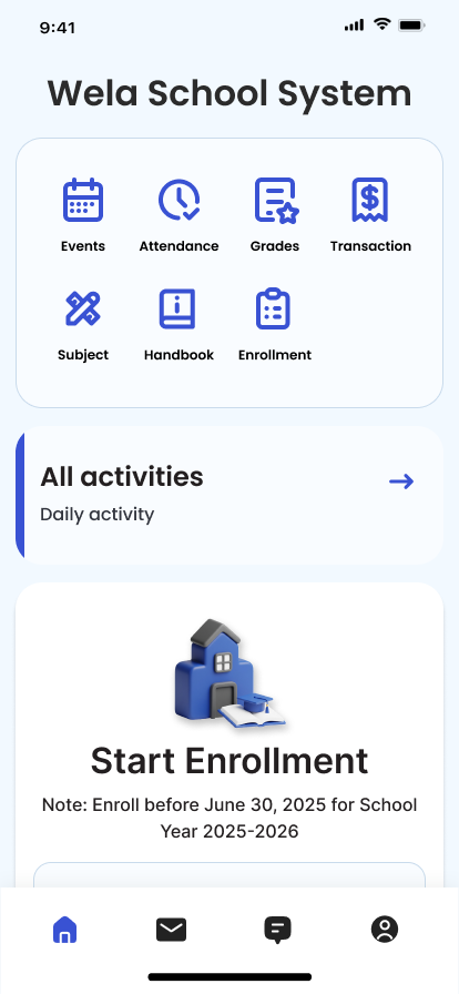
Home · "Start Enrollment" prompt
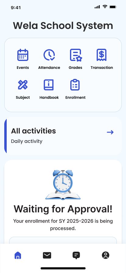
Home · "Waiting for Approval" state
Enrollment form — collapsed & expanded
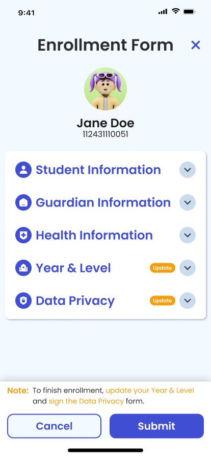
Form · All sections collapsed, badges highlight what to update
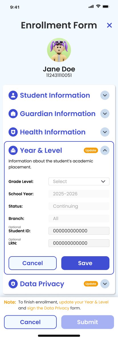
Form · Year & Level section expanded with fields
Full re-enrollment flow — all screen states in Figma
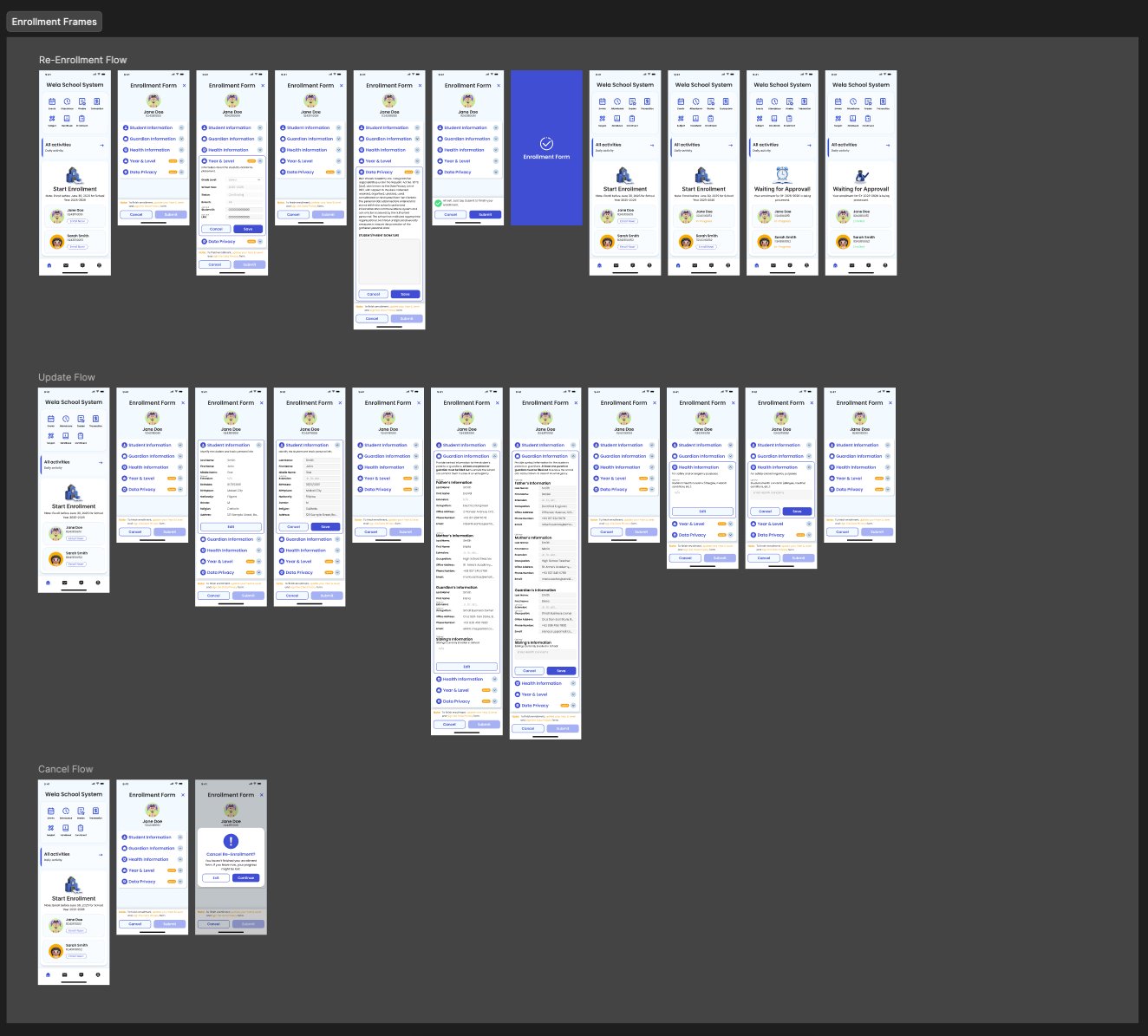
Re-enrollment · Update · Cancel flows — complete prototype in Figma