The design
All the screens. 🖼️
Every screen state designed, from the idle classroom photo all the way through to access granted and the admin dashboard.
TV Panel — idle & face detection states
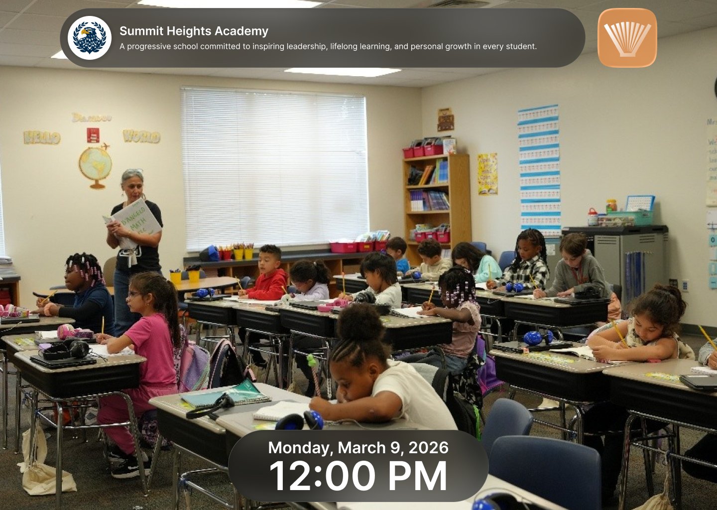
Idle state · School photo + live clock
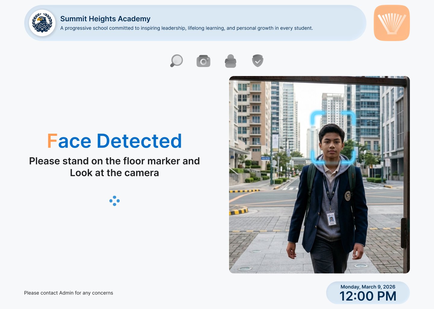
Face detected · Stand on marker, look at camera
TV Panel — scanning & recognition
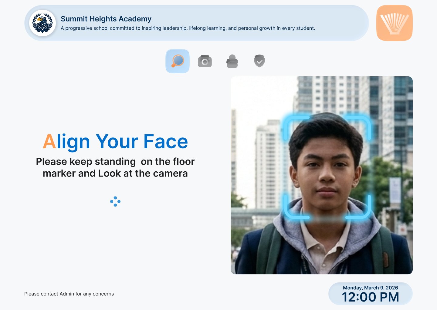
Align your face · Look at the camera
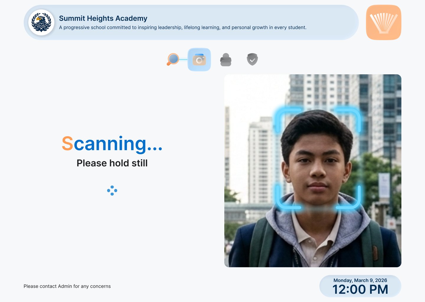
Scanning · Please hold still
TV Panel — match found & access granted
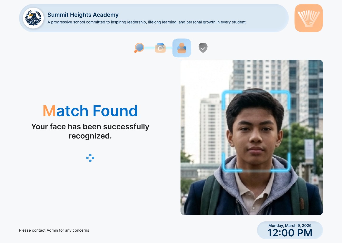
Match found · Face successfully recognized

Access granted · Please proceed, next student
TV Panel — student info display
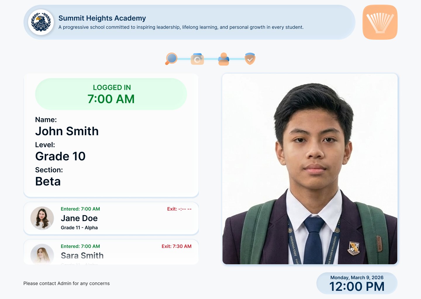
Student info · Name, grade, section, entry time + recent log of other students
PC Panel — admin / guard dashboard
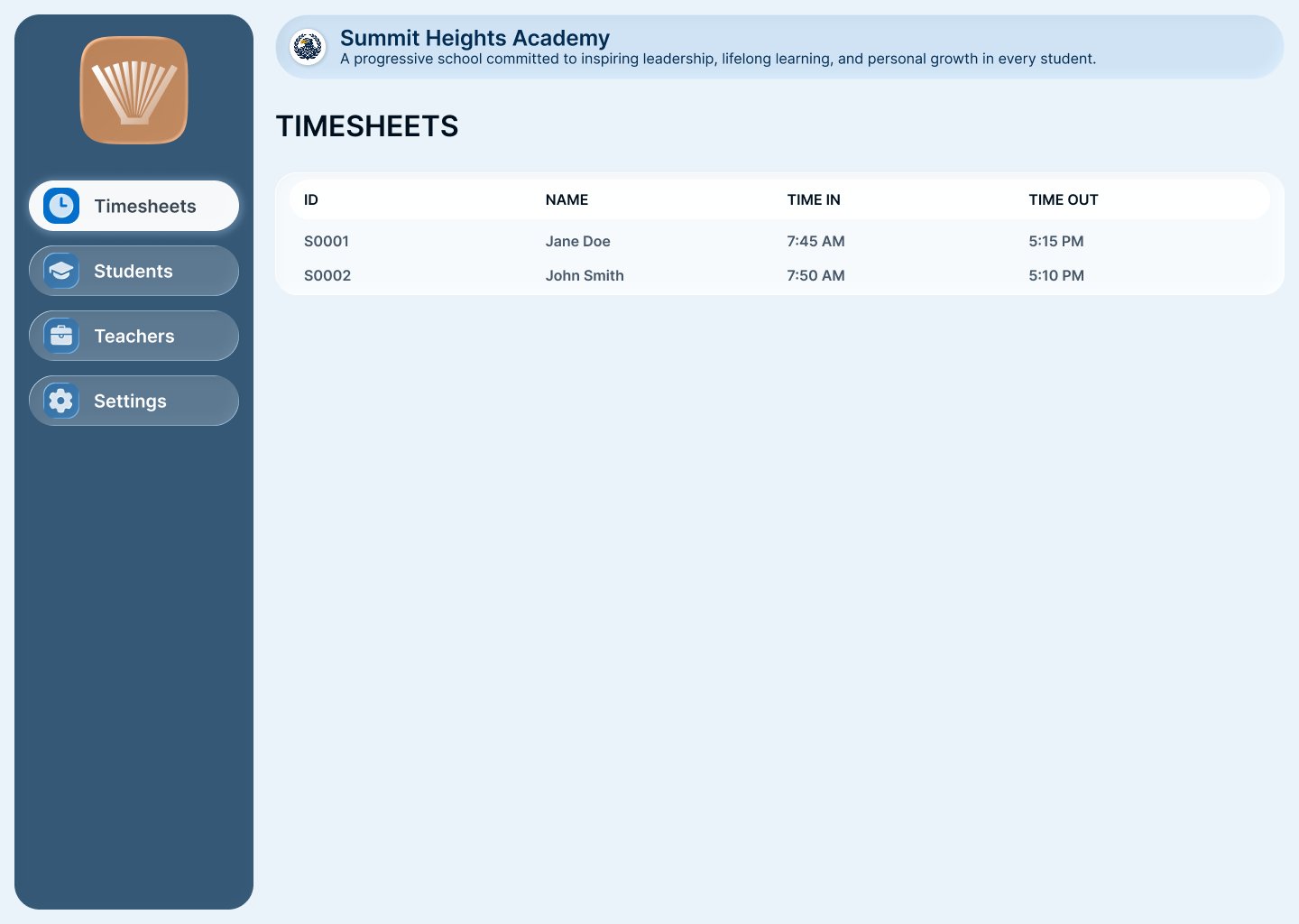
Admin dashboard · Timesheets with Time In / Time Out for all students